Look at the center of the mark. Between the overlapping circles is a small, pointed oval. Try reading it as an eye, then let your attention move outward to the four colored squares.
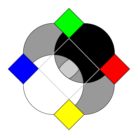
The flat mark. Follow the curved outlines through the center to find the eye.
The eye is a way of reading the arrangement. Its outline emerges where other shapes meet. That is the part of the design we wanted to connect with understanding: seeing a relationship among things you could also look at separately.
Behind the mark
We use the circles to represent ideas: concepts, models, and theories. The colored squares stand for things those ideas try to account for: objects, observations, and events. These are meanings we give the design. Black, white, and grey suggest contrast and mediation, without prescribing how a disagreement should end.
The three-dimensional version develops this vocabulary into eight spheres and six colored cubes. An underlying cube provides the arrangement: spheres occupy its eight corners, while the colored cubes lie along the six directions through its faces.
The diagram below strips away the surfaces so you can count the positions. Viewed squarely along one face, front and rear corners line up in four pairs. Four face directions extend around the edge; the other two point toward and away from you.
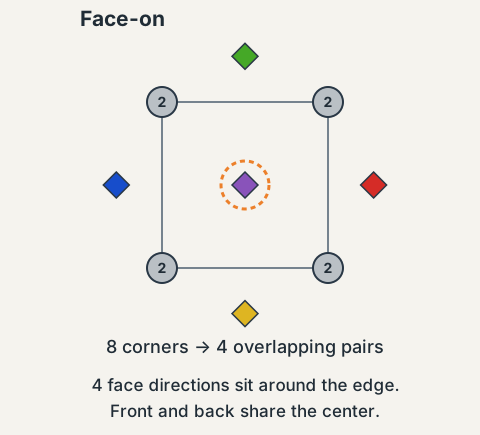
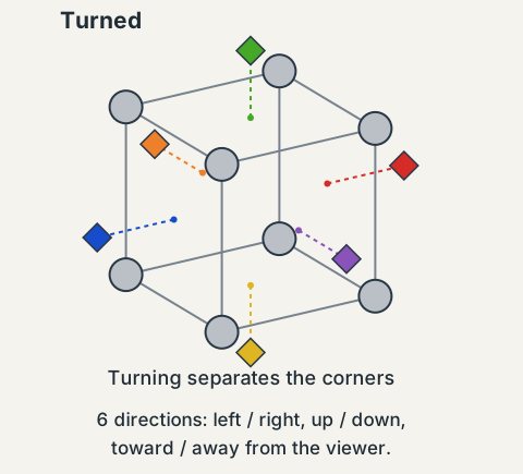
Construction schematics, with spacing simplified. Circles mark sphere centers; colored diamonds mark cube directions. The dashed orange ring indicates the rear direction.
Turn the arrangement and the overlapping positions separate. What looked like four locations has depth. The extra parts were there all along, hidden by the view.
What the solid object changes
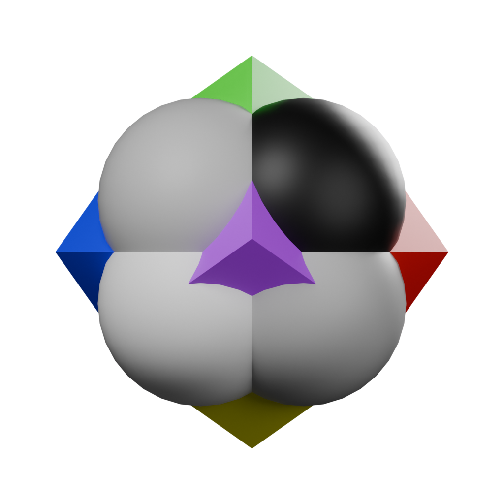
The solid logo in its familiar front view. The purple tip occupies the center, and surfaces conceal what lies behind them.
The flat mark is a stylized drawing of this arrangement. It keeps intersecting outlines visible, making the central eye easier to pick out. In the solid object, spheres block one another and a colored tip comes forward. The shared positions are recognizable, but the surfaces produce a different image.
That difference matters to the analogy. A view can reveal one relationship while obscuring another. In Nousfarer, a planet’s trail shows a field’s history, while the rooms inside an institute follow which ideas depend on which. How the World Is Built explains both. We chose a logo whose arrangement invites that small act of looking again.
Where you’ll see it
If you have played Nousfarer, you have already seen the solid logo from another angle. It sits on top of your ship.

The same arrangement, given a quarter turn, above the bridge of your ship.
Mounted there it is turned again, so a different tip faces forward and different spheres hide one another. It is still the same object; you are just seeing another view of it.
Read next: Why I Called It Noosaga, the story behind the name.