Graphic Design And Typography
Graphic design is the practice of arranging words and images on a surface—or a screen—so that a message is read in a particular way.
13 frameworks, from 2000 BCE to today · Design · Arts & Architecture
- Scribal and Epigraphic Traditions 2000 BCE-1450
- Movable Type and the Printed Page 1450-1800
- Poster and Commercial Lithography 1860-1910
- Arts and Crafts Book Design 1891-1920
- Corporate identity 1907-Present
- Constructivism 1915-1935
- Bauhaus 1919-1933
- New Typography 1928-1950
- Photocomposition and Digital Type 1950-Present
- Swiss Style 1950-1980
- Interface and Interaction Typography 1973-Present
- Desktop Publishing 1984-Present
- Grunge and Expressive Typography 1990-2000
Overview
Graphic design is the practice of arranging words and images on a surface—or a screen—so that a message is read in a particular way12. Typography, its closest companion, is the art of setting language in type: choosing letterforms, sizing and spacing them, and organising them on a page3. The two are usually inseparable. A poster works because its type and image pull the eye in a chosen order; a book works because hundreds of pages share a consistent typographic system. What is at stake in this history is control over how information reaches an audience, and that control has always been shaped by who could read, who could print, and who could pay. This article follows the field globally, from hand-lettered and inscribed traditions through the industrial print era to the screen.
Scribal and Epigraphic Traditions
Before printing, the display of text was a craft of the hand or the chisel. In China, inscribed bronze vessels from roughly the second millennium BCE carry some of the earliest examples of a developed writing system; later, brush-written manuscripts and carved steles established calligraphic traditions that valued stroke order and proportion as much as legibility. Roman monumental lettering—the inscriptional capitals on Trajan's Column in Rome, carved around the early second century CE—gave the Latin world a model of proportion between thick and thin strokes that later type designers would imitate again and again.
Across the Islamic world, calligraphy became a central art form: scribes developed cursive scripts such as naskh and the more decorative thuluth, and the written word was integrated into architecture and objects as ornament. Medieval European scriptoria produced illuminated manuscripts in which initials, borders, and marginal images organised a reader's progress through a text2. In Mesoamerica, Maya scribes painted bark-paper books and carved glyphs that combined pictorial and phonetic signs. What these traditions share is that the arrangement of text on a surface was understood as a designed object in its own right, with rules about hierarchy, spacing, and the expressive quality of the letter, long before anyone called this "graphic design."
Movable Type and the Printed Page
Woodblock printing existed in China by the seventh century, and movable ceramic and later metal type were in use there by the eleventh, allowing pages to be assembled from reusable pieces. In Europe, Johannes Gutenberg's development of movable metal type in the mid-fifteenth century combined several existing techniques—punching and casting letters, oil-based ink, and a modified screw press—into a system for reproducing text quickly. His forty-two-line Bible, produced around 1455, showed that printed pages could rival manuscripts in beauty while being far cheaper.
Gutenberg's achievement created a new problem: how to give printed books a coherent visual order. Early printers and typographers developed the page as a grid, with margins, columns, running heads (titles repeated at the top of each page), and consistent paragraphing. Typefaces were cut to resemble the regional handwriting of their customers—blackletter in Germany, roman in Italy, italic as a distinct, narrower companion face for compact settings. The Aldine Press in Venice, associated with the scholar-printer Aldus Manutius and his type cutter Francesco Griffo, issued small-format editions in the late fifteenth and early sixteenth centuries whose italic type and pocket size helped make classical texts portable.
Poster and Commercial Lithography
Printing's commercial possibilities expanded most dramatically with lithography, invented by Alois Senefelder around 17964. Drawing on a flat stone with a greasy crayon allowed designers to work directly at large scale, and by the later nineteenth century chromolithography could reproduce many colours45. The illustrated advertising poster became a mass medium in Europe and North America.
The artist who did most to define the poster as a designed object was Jules Chéret, whose Parisian posters from the 1860s onward used bold lettering, strong silhouettes, and cheerful colour. Around 1890, the French poster designer and lithographer Henri de Toulouse-Lautrec pushed further, reducing figures to flat, readable shapes. In Britain, the Beggarstaff Brothers (William Nicholson and James Pryde) in the 1890s built poster images from cut-paper forms. Art Nouveau, a decorative style of the 1890s and early 1900s with flowing, organic lines, gave the poster an international vocabulary: alphabets whose letters curved and intertwined, and advertising imagery that treated typography as ornament. This is the moment when graphic work increasingly became a job a client commissioned from a specialist rather than decoration added by the printer1.
Arts and Crafts Book Design
Against industrial printing's cheapness, the British Arts and Crafts movement argued for values the machine allegedly destroyed: good materials, legible and well-proportioned type, and an integrated relationship between text and ornament. William Morris founded the Kelmscott Press in 1891 and produced books set in typefaces he designed, such as Golden, printed on handmade paper with wide margins and decorative borders. The Kelmscott Chaucer of 1896 is the movement's most famous production. Morris's idealised medievalism was not the only path: the Doves Press, founded by T. J. Cobden-Sanderson and Emery Walker in 1900, stripped decoration almost entirely and relied on a single well-cut roman type and careful spacing. Both strands affirmed that page design was an art of judgement, not just an industrial default, and their arguments fed directly into later debates about what makes type readable.
Constructivism, New Typography, and the Bauhaus
The First World War and the Russian Revolution produced a graphic idiom that rejected ornament altogether. Russian Constructivism, emerging around 1915–1920, treated the printed page and the poster as vehicles for agitation16. El Lissitzky designed abstract geometric compositions and, in his 1923 book For the Voice, used bold type blocks and colour to make a book of poems function as a visual object. Constructivist designers such as Aleksandr Rodchenko composed with photographic fragments, diagonal axes, and sans-serif letters of different sizes—elements that made a message legible at a distance and from a moving vehicle.
The Bauhaus, the German design school founded by Walter Gropius in 1919, turned these experiments into a pedagogy7. Its preliminary course, or Vorkurs, taught students to investigate form, material, and colour before any applied project; its printing workshop, led briefly by the typographer and calligrapher László Moholy-Nagy, encouraged young designers to challenge conventional page layout. The Bauhaus is not a style but a way of teaching design as a systematic process, and its students carried its methods across Europe and the United States after the school's closure in 19337.
The New Typography, named by the German designer Jan Tschichold in his 1928 book Die neue Typographie, codified the Constructivist and Bauhaus impulses: asymmetric layouts, sans-serif type, standardised paper sizes, clear hierarchy of information, and the rejection of decorative framing. Tschichold's argument was functional—that typography should serve communication and be optimised for reading—though later in his career he moved back toward a more classical, symmetrical book style. The New Typography's supporters found it convincing because it matched the age of the machine, mass information, and the modern city; its critics found it doctrinaire and hard to read.
Swiss Style
From the 1950s onward, designers in Basel and Zurich—among them Josef Müller-Brockmann, Armin Hofmann, and Emil Ruder—developed what became known internationally as Swiss Style, or the International Typographic Style. Its hallmarks were a strict grid (a hidden structure of columns and rows that aligns elements), sans-serif typefaces such as Helvetica and Univers, left-aligned text with a ragged right edge, and photography used as a factual, objective element. Müller-Brockmann's concert posters, rhythmically composed of circle and line, and the grid-based work in his 1961 book Grid Systems in Graphic Design made the method teachable and exportable. Swiss Style spread through corporate identity, signage, and publishing because it promised clarity and consistency across many designers and many pieces—qualities institutions needed.
Corporate Identity Design
The same consistency argument gave rise to corporate identity design: the creation of a single visual system—logotype, typeface, colour, and layout rules—that identifies an organisation wherever it appears. Early programmes such as the work of Peter Behrens for the German electrical company AEG before the First World War anticipated the idea, and Swiss-trained designers later built full identity manuals. In the United States, Paul Rand designed marks for IBM, Westinghouse, and others from the 1950s onward, and his 1967 book Thoughts on Design argued for the logo as a sign whose meaning must be reduced to essentials. Around the same period, the Italian designer and entrepreneur Massimo Vignelli produced identities for companies and, famously, the New York City Subway map (1972), applying a strict graphic system to a complex public service. The shift was significant: the designer now planned not a single object but a rule set for many objects made by others.
Photocomposition and Digital Type
Mechanical metal type had dominated for five centuries, but from the late nineteenth century experiments with photographic typesetting gathered pace. The breakthrough came with the Linotype Photon and the Lumitype-Photon machines, introduced commercially in the 1940s and 1950s, and later with machines such as the Linotronic range and the typesetting systems of the 1960s—devices that exposed type onto film at high speed, letting designers set justified text in fine increments and use very large display sizes without enormous metal matrices. Photocomposition changed the economics of printing, and it freed type hybrids and optical effects once impossible in metal.
Digital type arrived through a parallel path: the PostScript page description language, released by Adobe in 1985, and the competing TrueType format introduced by Apple in the late 1980s, allowed typefaces to be defined as mathematical outlines and scaled to any size. Font design tools like Fontographer (from 1985) let designers draw their own. The distinction between designing a typeface and producing it collapsed; a single designer could now make a typeface in months rather than years.
Desktop Publishing
The Macintosh computer and the Apple LaserWriter printer, introduced in 1984, together with Aldus PageMaker software, released in 1985, sparked what became known as desktop publishing. For the first time, a designer could compose, typeset, and output a printed page at a desk without working through a typesetter or a print shop for every revision8. This made small-scale independent publishing routine, but it also shifted professional life: typesetters' shops lost work, designers took on production, and the discipline's skill set broadened to include software operation and file management. QuarkXPress, released in 1987, and later Adobe InDesign gave page layout programs the sophistication to handle long documents and precise typography.
Grunge and Expressive Typography
Desktop publishing's easy access to type and image generated a counter-reaction in the early 1990s. Designers such as David Carson, working on Beach Culture and then Ray Gun magazine in the 1990s, deliberately broke the grid: overlapping type, distorted letterforms, and reading order that demanded effort from the viewer. Typeface designers created distressed, deconstructed fonts—Emigre Type Foundry, founded in 1984 by Rudy VanderLans and Zuzana Licko, and its magazine Emigre became a key outlet for such work. The movement, sometimes called grunge or expressive typography, argued that legibility was only one value among many and that the page could convey mood and energy. Its critics countered that it made content hard to find; its defenders replied that design's job is communication, not neutrality, and that different messages warrant different forms.
Interface and Interaction Typography
The last four decades added a designed surface the earlier tradition did not anticipate: the screen. Early computer interfaces, such as the Xerox Alto's graphical user interface in the 1970s and Apple's and Microsoft's systems in the 1980s, used low-resolution bitmap letterforms designed for pixels. As screens improved, type on screens approximated print, but the interaction introduced new constraints. Text must scale between devices; fonts must load quickly; and a word or button can be a control rather than a statement.
Designers of interfaces drew on the Swiss grid for structure and on reading research for legibility, but also developed new conventions: the visual hierarchy that tells a user what is clickable, the placeholder and the label, the error message, the responsive layout that reflows when the window changes size. The web, from the Browser wars of the 1990s through the refinement of CSS typography and the development of variable fonts, made typographic decisions enforceable by code. Mobile devices made small-screen legibility a problem for everyone, not just newspaper designers. The questions that remain are the field's oldest: how much control the designer should have over a document that readers or users can alter, and how a typographic system sustains meaning across media it was never designed for.
References
- Graphic design (introduction, History, Twentieth century), Wikipedia
- History of graphic design (introduction, History of graphic design), Wikipedia
- Typography, Wikipedia
- Lithography, Wikipedia
- Chromolithography, Wikipedia
- Constructivism (art), Wikipedia
- Bauhaus, Wikipedia
- Desktop publishing, Wikipedia
The frameworks of Graphic Design And Typography
Each framework is a way of working the field has used: when it held, and the question it answers.
- 2000 BCE-1450
Scribal and Epigraphic Traditions
How should letters be shaped and arranged by hand?
- 1450-1800
Movable Type and the Printed Page
How should a printed page be organised for reading?
- 1860-1910
Poster and Commercial Lithography
How can a printed image sell to a crowd?
- 1891-1920
- 1907-Present
Corporate identity
How can one visual system identify an organisation everywhere?
- 1915-1935
- 1919-1933
- 1928-1950
- 1950-Present
Photocomposition and Digital Type
How can type be set and reproduced by machine?
- 1950-1980
- 1973-Present
Interface and Interaction Typography
How should type work on an interactive screen?
- 1984-Present
Desktop Publishing
How can one person set and lay out a whole publication?
- 1990-2000
Grunge and Expressive Typography
How can type express feeling rather than order?
How the ideas connect
Each arrow runs from an earlier idea to the later one it shaped. The list below says what passed between them.
New Typography influenced by Constructivism
Jan Tschichold's Die neue Typographie codified the Constructivist devices—asymmetric layout, bold sans-serif type blocks, diagonal axes—into a set of rules for everyday printing. Tschichold drew directly on the Russian and Bauhaus experiments he had seen in the 1920s.
Carried by Jan Tschichold; Die neue Typographie (1928).
New Typography influenced by Bauhaus
Tschichold's New Typography generalised the Bauhaus workshop's teaching about functional, standardised layout into a published doctrine. The Bauhaus emphasis on elementary form and the rejection of decorative framing is the direct source of his rules.
Carried by Jan Tschichold; Die neue Typographie (1928).
Swiss Style grew out of New Typography
Swiss Style grew out of the New Typography's programme: asymmetric layout, sans-serif type, standardised formats and clear hierarchy were carried into the Basel and Zurich schools by teachers trained in the Tschichold tradition. The grid became the explicit method for realising those principles.
Carried by Josef Müller-Brockmann; Emil Ruder; Armin Hofmann.
Movable Type and the Printed Page influenced by Scribal and Epigraphic Traditions
Gutenberg's movable type reproduced the page conventions of medieval manuscripts—the column, the rubricated initial, the marginal gloss—so that printed books would be legible to readers trained on scribal books. Typefaces were cut to imitate regional scribal hands, blackletter in Germany and humanist roman in Italy.
Carried by Johannes Gutenberg; Forty-Two-Line Bible (1455).
Arts and Crafts Book Design revived Scribal and Epigraphic Traditions
William Morris modelled the Kelmscott Press on medieval manuscript and early printed books, designing typefaces, borders and initials in deliberate imitation of scribal page design. The Kelmscott Chaucer of 1896 is the movement's fullest revival of the illuminated manuscript as a printed object.
Carried by William Morris; Kelmscott Press; Kelmscott Chaucer (1896).
Arts and Crafts Book Design reacted against Movable Type and the Printed Page
The Arts and Crafts book designers defined themselves against the cheap industrial printing that descended from Gutenberg's system, arguing that machine production had degraded paper, ink and type. Morris's Kelmscott Press set handmade paper and hand-cut type against the commercial press.
Carried by William Morris; Kelmscott Press.
Bauhaus influenced by Constructivism
The Bauhaus printing workshop, led by László Moholy-Nagy, took up Constructivist principles of asymmetric composition, geometric form and sans-serif type and turned them into a teaching programme. El Lissitzky's experiments were known and discussed at the school in its early years.
Carried by László Moholy-Nagy; El Lissitzky.
Desktop Publishing grew out of Photocomposition and Digital Type
Desktop publishing put the photocomposition and digital type technologies of the 1950s–70s onto the personal computer, so that type could be set and pages assembled by an individual. The PostScript page-description language and digital typefaces were the direct technical basis of the desktop publishing revolution.
Carried by PostScript (1984); Apple LaserWriter (1985).
Grunge and Expressive Typography reacted against Swiss Style
Grunge and expressive typography defined itself against the Swiss grid's order and clarity, treating legibility and consistency as constraints to be broken. Designers such as David Carson set overlapping, distorted type in deliberate opposition to the International Typographic Style.
Carried by David Carson.
Grunge and Expressive Typography influenced by Desktop Publishing
Grunge typography exploited the new desktop tools—layered, distorted and degraded type made easy by page-layout software and cheap font editing. Designers used the very flexibility of desktop publishing to produce deliberately messy, expressive lettering.
Carried by David Carson.
Poster and Commercial Lithography influenced by Movable Type and the Printed Page
The poster inherited the printer's letter—wood and metal display types set alongside images—and lithographic poster designers worked with the same typefounders' alphabets as book printers. Chéret and his contemporaries drew on the commercial type specimen tradition that grew from the printed page.
Carried by Jules Chéret.
Constructivism influenced by Poster and Commercial Lithography
Constructivist poster designers took over the large-scale, mass-audience poster format and its bold lettering from the commercial lithograph tradition, then stripped away its ornament. Rodchenko and his peers worked in the same medium of the street poster while rejecting its advertising idiom.
Carried by Aleksandr Rodchenko.
Beyond the field
Where Graphic Design And Typography's ideas came from in other fields, and what they led to there: the strongest 12 of 61 links.
Scribal and Epigraphic Traditions grew out of Writing system in Visual Communication
Scribal and epigraphic traditions grew directly out of the invention of writing systems in Mesopotamia and Egypt; the scribal craft of wedge and brush forms is the practice built on those scripts.
Carried by Cuneiform script; Egyptian hieroglyphs.
Scribal and Epigraphic Traditions influenced Movable type and the printed page in Visual Communication
Early printers took over the scribal page: humanist scribal scripts were cut as type, and manuscript conventions of layout, rubrication and initials were imitated in incunabula before print developed its own norms.
Carried by Gutenberg Bible (1455).
Movable Type and the Printed Page led to Print Culture in Visual Communication
Print culture is the broader social formation that grew directly out of movable type and the printed page; the technology of the press is its foundation.
Carried by Johannes Gutenberg.
Poster and Commercial Lithography influenced by Lithography in Printmaking
Poster design and commercial lithography rest on Senefelder's invention of lithography, which made large colour posters cheap to print.
Carried by Alois Senefelder.
Constructivism influenced Constructivist Exhibition Design in Curatorial Pedagogy And Publics
Constructivist exhibition design took its formal vocabulary of geometric abstraction, photomontage and spatial typography directly from Constructivism in graphic design and typography. El Lissitzky's exhibition work carried these graphic devices into three-dimensional display.
Carried by El Lissitzky.
Bauhaus influenced by Deutscher Werkbund in Design For Sustainability
The Deutscher Werkbund's campaign to unite art and industry and its standardisation debates were taken up directly by the Bauhaus founders, and Werkbund members such as Gropius shaped its programme.
Carried by Deutscher Werkbund; Walter Gropius.
Bauhaus influenced by Deutscher Werkbund in Design Ethics
The Werkbund's ethic of good form and social responsibility in mass production passed into the Bauhaus programme through figures like Gropius and Muthesius's standardisation dispute.
Carried by Deutscher Werkbund; Walter Gropius.
New Typography influenced International Typographic Style in Visual Communication
The New Typography of the 1920s, developed at the Bauhaus and by Jan Tschichold, supplied the asymmetric layout, sans-serif type and functionalist page that the Swiss school systematised into the grid after 1950.
Carried by Jan Tschichold; Bauhaus.
New Typography influenced International Typographic Style in Visual Communication
The New Typography of Tschichold and the Bauhaus circle supplied the Swiss style its commitment to asymmetric layout, sans-serif type and functional hierarchy; Tschichold's 1928 book was a direct model for the postwar Swiss designers.
Carried by Jan Tschichold; Die neue Typographie (1928).
New Typography influenced by Constructivism in Visual Communication
Constructivist typography and photomontage, especially the work of El Lissitzky, gave New Typography its asymmetric, element-based compositional method, which Tschichold acknowledged as a source.
Carried by El Lissitzky; Jan Tschichold.
New Typography influenced by Bauhaus in Visual Communication
Bauhaus teaching and its typography workshop under Moholy-Nagy supplied New Typography with its principles of asymmetric layout, sans-serif type and functional clarity, which Tschichold codified.
Carried by László Moholy-Nagy; Jan Tschichold.
New Typography influenced by Bauhaus in Visual Communication
The Bauhaus's social programme of design for mass communication fed into New Typography's claim that typography should serve clear public communication rather than fine printing.
Carried by László Moholy-Nagy; Jan Tschichold.
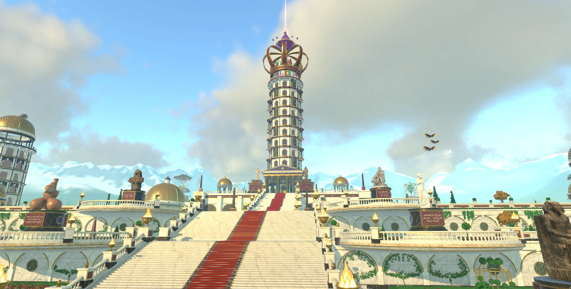
Graphic Design And Typography is a planet in Nousfarer
Its city has a tower for each of these 13 frameworks. Land, walk in, and climb one concept at a time.
Land on Graphic Design And TypographyRelated fields
Fields its ideas are linked to
- Visual Communication 19 links
- Visual Communication 16 links
- Printmaking 7 links
- Architectural Theory 1 link
- Digital Design Theory 1 link
- Modern Architecture 1 link
- Exhibition History 1 link
- Design 1 link
- Design Ethics 1 link
- Design For Sustainability 1 link
- Industrial Design 1 link
- Product Design Theory 1 link
More in Design
- Design
- Design Ethics
- Design For Sustainability
- Design Methods
- Design Research
- Industrial Design
- Interaction Design Theory
- Product Design Theory
- Service Design
- Speculative Design
- Visual Communication
See where Graphic Design And Typography sits on the Map of Human Knowledge